
The ones with the absolute most, are, by and large, contributing the absolute least?
Ah but they’re contributing in many other ways! Like, um… uh… let me think for a second…
Hmmm… I’m sure it’ll come back to me eventually…
https://taxfoundation.org/data/all/federal/latest-federal-income-tax-data-2024/
I hate to be that guy but the top 5% pays nearly 50% of all income taxes paid.
Don’t get me wrong the system is broken.
And the top 10% owns 67% of all the wealth (I’m not seeing an option to show just the top 5%). Considering how many millions and billions of dollars they all own, it only makes sense that they’re also paying the most. Especially since they can easily afford it without lowering their standard of living.
Absolutely agreed they can afford it. I just don’t like having disingenuous data presented. The % shown makes it look like they’re not paying as much taxes as the rest of us. The reality is they pay the most. We shouldn’t have to stoop to creating fuzzy charts, we don’t need to because the other numbers are even worse, as you have shown. They own 67% of all the wealth, which is insane.
I just don’t like having disingenuous data presented
The difference between fighting disingenuous data and reframing the issue to favor another party is the degree in which the so-called disingenuous aspect actually matters.
In this case, the fact that the top 4% pay materially more than the rest doesn’t actually matter because they own the vast majority of the wealth. If that same wealth were evenly distributed, more of it would be paid into the system. And that is the point.
What you are doing is not representing the other side of a disingenuous issue, what you are doing is framing the issue in a way that favors the wealthy by citing a statistic that is beside the point.
That in itself is dishonest and a talking point that the wealthy use regularly to try and convince people that they are actually the good guys.
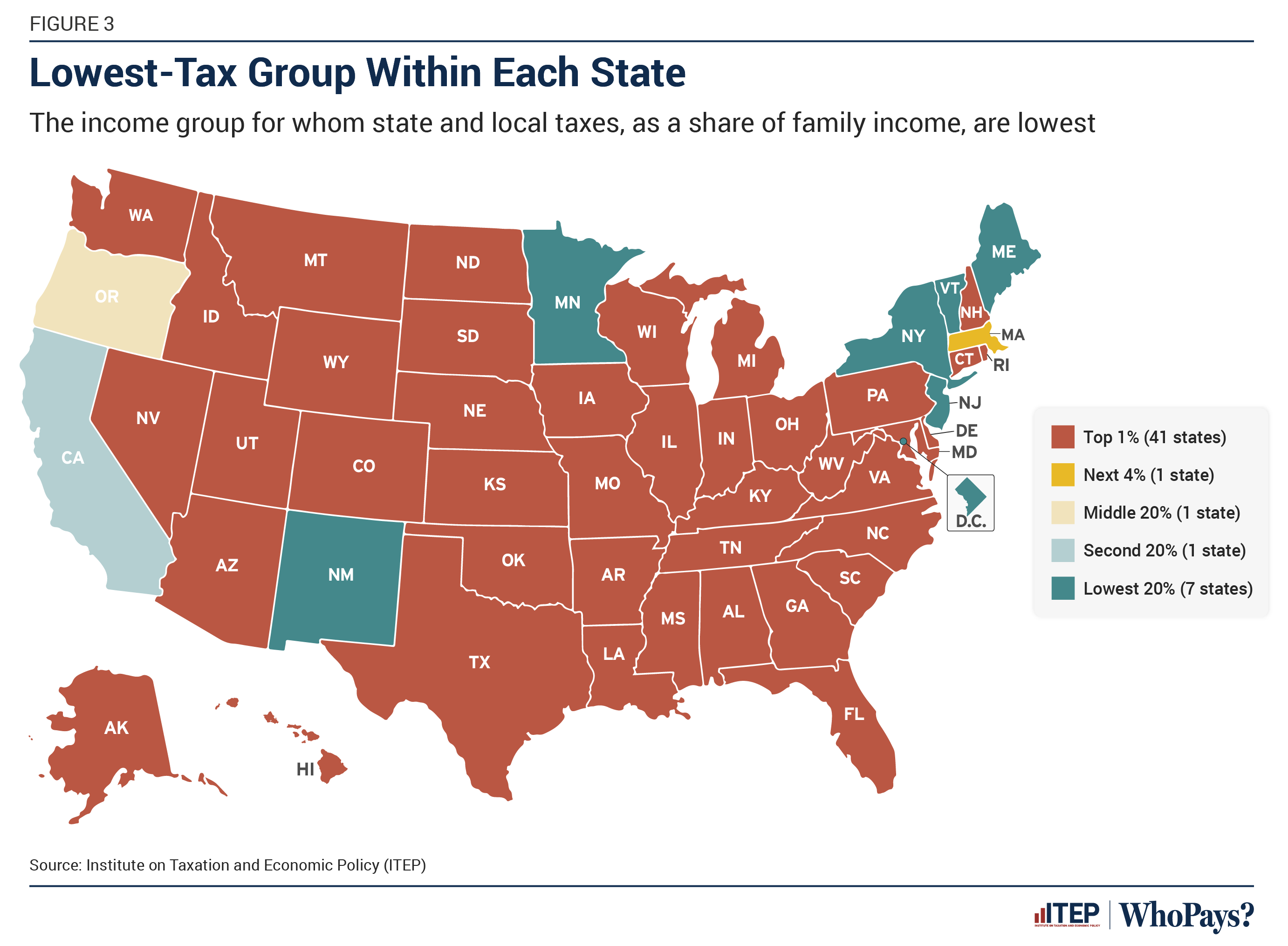
The graph is showing who pays the least as a percentage of family income. I really don’t think it’s disingenuous to be talking about tax rates as percentages rather than the total amounts paid.
The % shown makes it look like they’re not paying as much taxes as the rest of us.
That’s because proportionally, they are paying less. Millionaires and billionaires are paying taxes at a lower rate then everyone else, even though they have so much more disposable income.
I don’t know what your ideal version of talking about this would be, but these three facts, that the top 1% pay the least proportionally, the top 5% pay the most in absolute terms, and the top 10% control two thirds of all the wealth, are all related in a pretty basic way.
Alaska, Florida, Nevada, South Dakota, Tennessee, Texas, and Wyoming all have no state income tax. Am I missing something, or is this graph just misinformation?
Penny power bitches.
Looks like mods gay
