

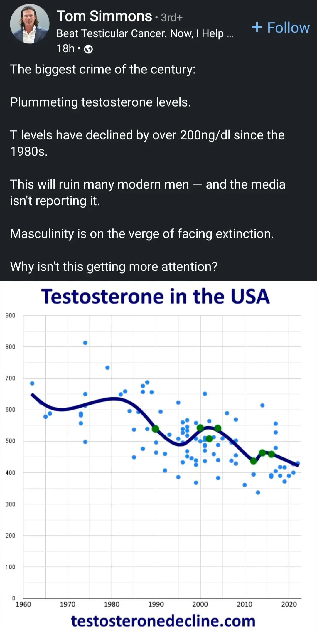
Alt Text: post that says dripping testosterone levels in men since 1980s is the biggest crime of the century.
Whoever drew that wavy line has no idea what a regression is
You are right it just looks like they used Excel + curve fitting.
if you ever feel down and redundant look at the degrees of freedom in this fit and feel better
No it’s just R^7 regression! Testosterone levels will be negative by next week!
Edit: and male bodies were approximately 2000% testosterone in the 1940s!
I can’t think of a more reliable source than testosteronedecline.com
From the website:
The truth is that [the] whole project is (most of the time) quite inaccurate and error-prone, and often involves way too little data to really make a judgment, despite my best efforts. It also involves my amateur method of “age-adjusting” the results to be comparable. So this whole project is quite inaccurate and shouldn’t be used for serious conclusions. But if you understand the inaccuracies involved, you still may find it interesting.
“Listen, we know we’re full of shit, but that won’t stop your anti-trans uncle from posting our nonsense on Facebook.”
How much do you want to bet that the source is somebody trying to sell some sort of snake oil claiming to boost testosterone.
It’s a terrible graph anyway. The outliers haven’t been removed and I completely don’t understand the line of best fit that’s been drawn because it appears to be squiggly. How can it be squiggly, it’s a line of best fit, it’s an approximation. Oh and making some of the points green does not increase their validity.
A useful approximation of normal T levels in humans can be seen in present day hunter gatherers in Africa. The Hadza tribe was shown to have an average level of 151pmol/l, well below that of what we see in societies such as America. We can, therefore, argue that the reduction of T levels in modern man over the last few years is a shift back towards the norm.
That face when high testosterone turns out to be caused by lead in petrol.

